David Bailey
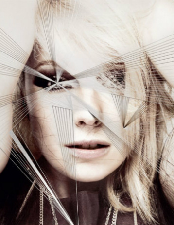
David Bailey is an English photographer, he's regarded to be one of the nation's best photographers. He's done work for top fashion magazines such as vogue as well as freelance work. I've chosen two iconic images taken by him, one being of Leslie Caron which was photographed for Vogue in 1965. The other being Mick Jagger which was taken in 1964.
David Bailey is an English photographer, he's regarded to be one of the nation's best photographers. He's done work for top fashion magazines such as vogue as well as freelance work. I've chosen two iconic images taken by him, one being of Leslie Caron which was photographed for Vogue in 1965. The other being Mick Jagger which was taken in 1964.
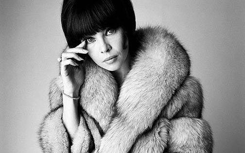
This photo of Leslie Caron who is a French actress and dancer. The photograph is a closeup portrait of her, the image has no blur but instead a sharp focus. Despite the image being in black and white there is a strong contrast between her dark hair and her pale fur jacket, this makes the image seem more bold and powerful. Her eyes are also a focal point of the photograph as they are staring directly at the lens. The composition of the image is very intriguing as her hand is touching her face and brings dynamic to the picture. Also the portrait is very closeup and a part of her head is cut off the frame, despite this she is very much in he center of the image. I think the use of the fur coat makes Leslie appear rich and of a high class, this could link into the time of the photograph (1965) where class and status were far more important than they are now. The photograph was clearly taken in a studio with a white backdrop, the lights have been positioned to have more light exposed on the left side of her face rather than the right side. This is one of my favorite images by David Bailey because firstly the power and intensity of her eye contact creates a very strong and mysterious image, her facial expressions give little away adding to becoming more intrigued of what her thoughts are. I also adore the use of the fur coat which gives Leslie a classy, elegant and luxurious look which resembles many typical French women of that time and perhaps what Bailey was aiming for. Lastly I love Bailey's use of black and white, this adds to the elegance and grace of the picture and the simplicity of it adds again to the idea of being a beautiful, classy French women of the 1960's.
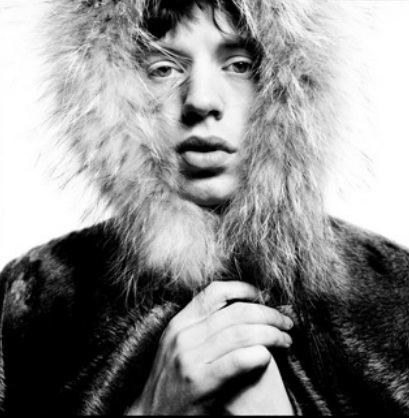
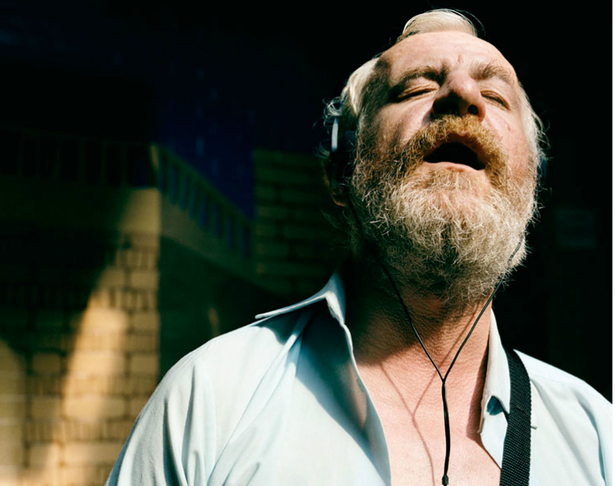
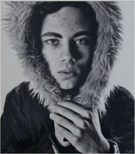
This photograph of Mick Jagger is very similar to that of Leslie Caron's, the use of black and white, being closeup, having part of the head cut off and again the use of fur. The main focus of this image is the fur hood, as the image is so close, it becomes the main focus because it is covering much of his head and the side parts of his face. I feel as if Bailey has created a slightly sinister mood due to the fact Mick Jagger has his hood up, it's as if he is hiding or protecting himself against something. There is a contrast between his dark coat and the pale hood, this creates a more powerful image and brings more focus to his face. I also think the use of a square picture over a rectangle enhances the intensity of the focus being of Mick Jagger's face. The shadows on the left side of his face from his mouth and nose create more dimension and depth to the photograph because it creates a much stronger image with a more mysterious tone. Again like Leslie's photo, Mick is staring directly into the camera lens bringing an intense focus to his eyes. This photo was taken in the 1960's before his career took off, this photo doesn't reveal much about him and nor his inner punk self. Instead he's portrayed to be slightly classy and almost slightly feminine. I think the photograph of Mick Jagger is an extremely successful composition which shows a more delicate side of Mick Jagger which is not as seen today. The use of having the face so close and in focus creates a strong image with an almost unclear meaning, leaving it up to the person seeing the photograph to judge.
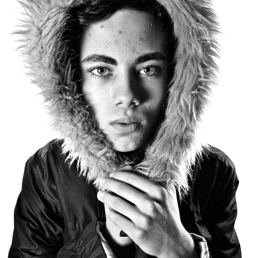
Here is the recreation of the photograph of Mick jagger. To recreate the picture I had to pay close attention to the lighting and had one main studio light on the right and the left which was put on a lower setting to make the lighting less harsh. We used the classic plain white backdrop and zoomed in but making sure to have the top of the head cut off. I attempted to get a facial expression as similar to Mick Jagger's with a slight pout and also having the hand wrapped around one another at the bottom of the hood. Lastly I had to re-create the shadow effect on the face around the nose and mouth.
Rankin
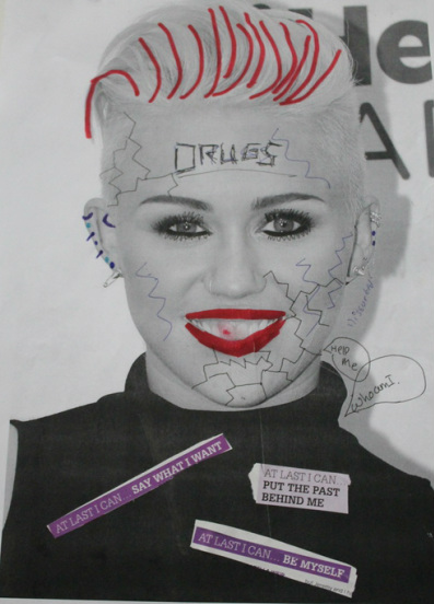
Rankin was born in 1966 and is a famous English portrait and fashion photographer. He has taken many famous photographs of celebrities which he gave back to them to destroy and distort.
I like both these images by Rankin, I feel his use of getting celebrities to destroy their own photos, is giving them a chance to reflect their own personalities and how they really are over how the media portrays them. It's a clever idea which allows them to express themselves and have their own say over how they really are.
I re-created two of my own images by Rankin, one being of a famous celebrity (Miley Cyrus) and one being of myself. The one of Miley Cyrus that I re-created was inspired by how she's recently been portrayed in the media, they've shown her to be out of control and growing up from her old Disney channel self. I destroyed the photo by adding heavy makeup and highlights to her hair as well as more piercings to show how she's more grown up. I also added quotes at the bottom such as 'At least I can...be myself', this is because Miley has said this before in interviews that this new out of control person is the real her and who she wants to be. Also the quote 'At last I can...put the past behind me', reflects not wanting to be like her old Disney channel self and wanting to be more like a young adult. Lastly I added cracks to her face to show that she is slightly broken underneath because her out of control self has been known to turn to drugs and partying, which have been portrayed negatively in the media.
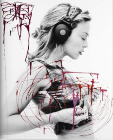
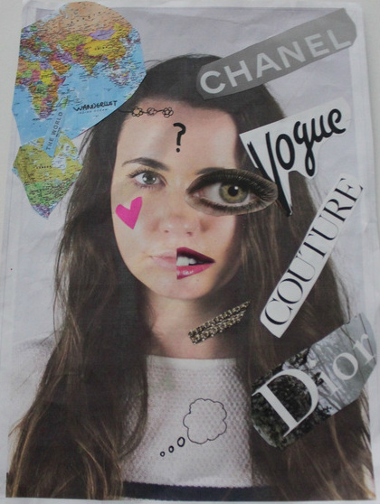
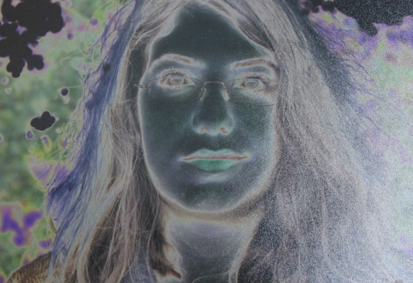
I then re-created an image of myself, I divided my head shot into two different sides to reflect two different sides of my personality. I cut out the names of famous fashion designers and stuck them on the right hand side to show a more materialistic side to me. I also added an exaggerated eye and lips to show a more partying side to me. On the left hand side I cut out a world map to show my less materialistic side and the side which cares more about the basic things in life. I also added a heart to my cheek to show that I have a more caring and loving side which doesn't always show through on my materialistic side. I then added a thinking bubble and a question mark in the middle of the picture to show that I'm not sure which side is the real me and which side has more control over the other.
I then re-created an image of myself, I divided my head shot into two different sides to reflect two different sides of my personality. I cut out the names of famous fashion designers and stuck them on the right hand side to show a more materialistic side to me. I also added an exaggerated eye and lips to show a more partying side to me. On the left hand side I cut out a world map to show my less materialistic side and the side which cares more about the basic things in life. I also added a heart to my cheek to show that I have a more caring and loving side which doesn't always show through on my materialistic side. I then added a thinking bubble and a question mark in the middle of the picture to show that I'm not sure which side is the real me and which side has more control over the other.
Deirdre O'Callaghan
Deirdre O'Callaghan is an Irish photographer whom worked on a project called 'Hide That Can', it consisted of her taking photos of Irish expatriates who sought refuge at Arlington House in Camden, London to try to improve their lives. She documented the men's lives and their struggles with drink, isolation and neglect. There are two images which particularly stood out for me from her work on the project.
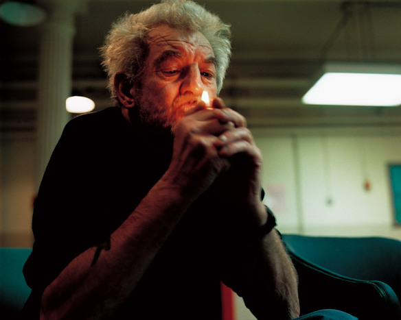
I find this image especially intriguing because compared to many of O'Callaghan's images, this image shows a much happier and positive vibe. The man doesn't have alcohol in the picture which could suggest he is in recovery and is past his worse stage of his life. The lighting of this picture also resembles that as the background is in complete darkness whereas his face is in complete light, this could show that he is coming out of the dark times of his life, this could include him going back to Ireland. Also I think the main focus of the image is the angle of his face which is captured upwards and not downwards this reflects positivity and a sense of hopefulness. The man is also listening to music which captures an essence of him being in his own world and being happy and content with it.
I like this image by Deirdre as I think it resembles the little hope this man has left. The way the man is looking at the lighter with such hopefulness and sadness makes you realize how little the men have. I think it also shows a sinister mood as the lighting is fairly dark, apart from a light in the background and the lighter itself. I think the composition of the man also shows how sad and hard their lives are, the fact his elbows are on his knees reflect the fact that he may be slowly giving up.
Martin Parr - The Last Resort
Initial and latter thoughts on the times of Thatcher
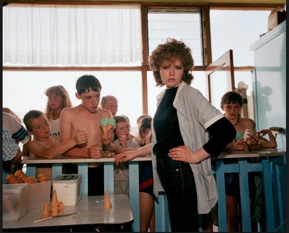
The first image I've chosen shows a busy crowd of children waiting to buy ice cream, there is a woman standing behind a set of blue barriers looking almost superior compared to the children. I think this image is a reflection of the economic times in the North of England especially Liverpool where this photo was taken, the children represent many of the working class people in Liverpool who suffered with Margret Thatcher's economic policies. The woman represents the hierarchy of not being affected by Thatcher's policies and being above the others. The clever use of the barrier separates the two, which could be a representation of the North-South divide which came about at the time of Thatcher. The composition of the photo is done so the woman is the focus point which cleverly links to the fact that she has a higher status compared to the children. I think there is a strong contrast between the busyness of the children and the clutter of them and then the simplicity of the woman standing by herself. It shows a strong correlation to what what occurring at that time with the economy. I think the mood created by this image is slightly somber yet it also gives off a sense of not caring about the hardships and just making the most of it, I think the woman doesn't like the chaos of it as perhaps it doesn't affect her and she doesn't want to be associated with the working class. The tones of the picture are quite bright, there's a range of colours through the busyness of the children however there is a contrast between the woman as she is dressed in complete black, showing a much dull and less vibrant side.
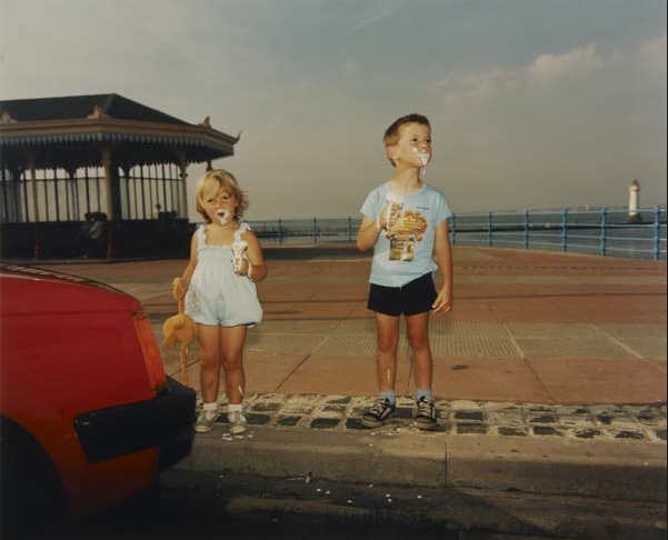
This image shows part of a red car and two children dressed in blue eating ice cream. There is an immediate contrast between the red car on the left which represents labour and socialist policies with the children who are wearing blue which represents conservative ideas. I think the children show that they are a product of what Thatcher has done, and shows them to be left with very little. I think the idea of innocence is heavily conveyed from this photograph because the children have clearly had a fun day at the seaside, have ice creams in hand and the girl is holding a stuffed animal. It shows how they are probably blissfully unaware of the economic hardships which are occurring at that time. I think that the lighting is fairly neutral, and the tones are as well apart from the red car which is a comp;e a contrast with the other colours and hence makes it focus point of the picture. The boy on the right is looking into the distance which even though he is probably unaware of any economic problems it could symbolise a sense of hope for the future. There is again like the other image a very carefree mood to this picture, there is ice cream down both the children's legs showing a sense of being carefree and not knowing about the economic hardships of that time.
Portrait Booklet
For the portrait booklet I had to take 10 different types of portraits.
For the portrait booklet I had to take 10 different types of portraits.
Close up
Patterned
Sepia
Reflection
Studio
Camouflage
Extreme angled
Balanced
Perspective
Solarise
Framing the subject
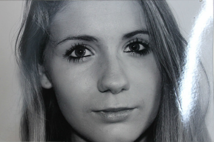
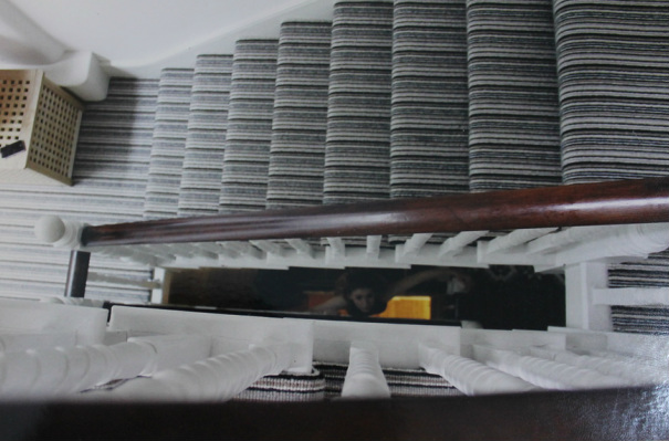
In portraiture it's important to focus on the framing and angle of a subject. I've focused on four main points of view and types of framing, the first being birds eye view, the second being mid-view, the third being a close up view and the fourth being a worms view.
In portraiture it's important to focus on the framing and angle of a subject. I've focused on four main points of view and types of framing, the first being birds eye view, the second being mid-view, the third being a close up view and the fourth being a worms view.
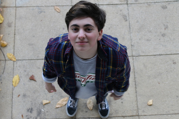
Birds eye view
Mid-view
Closeup
Worms view
Portrait Project
Mood board
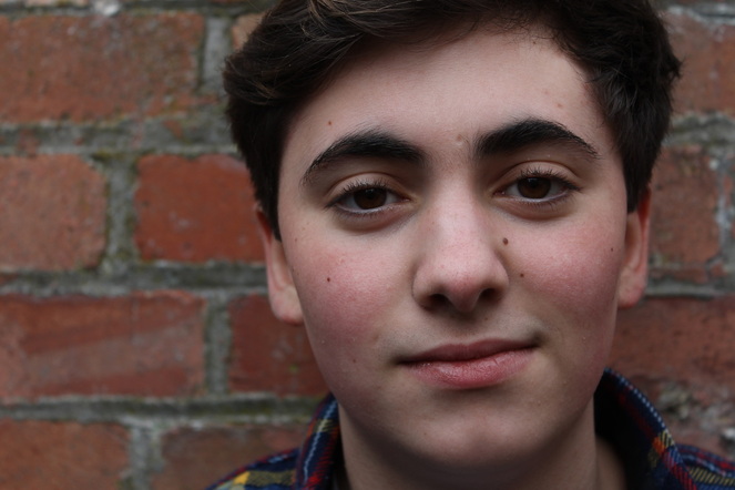
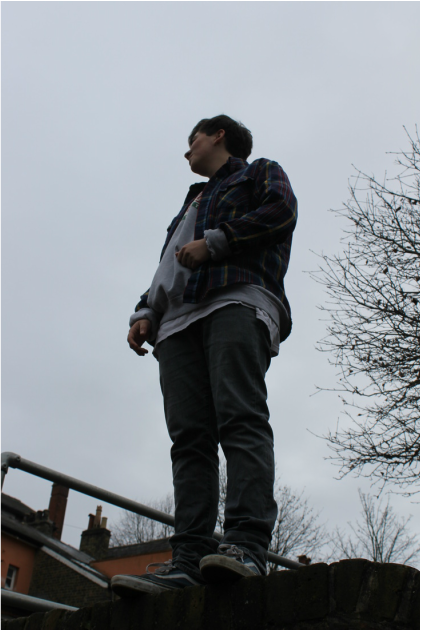
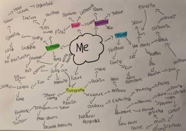
The first mood board I've done is a basic mind map of words which describe me and my personality. I feel this helped me highlight certain points and key features which I could develop further. I picked out of the mind map five sections which I feel are the main ones, these are highlighted as: travel, friends, photography, food and fashion.
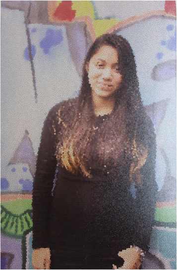
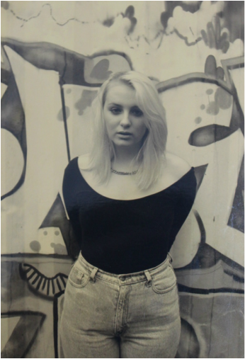
Theme: Street photography
I've decided to focus on street photography as it in an area of photography I really enjoy, I wanted to explore the idea of poverty vs wealth and expand the idea of general street photography to personal portraits of strangers on the street.
First Development
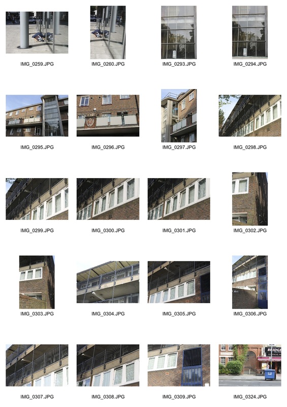
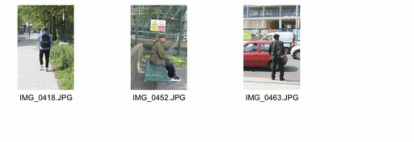
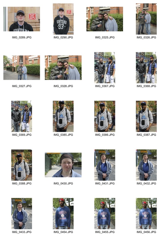
For my first development I went around South London and photographed areas which seemed to be affected by poverty, I tried to capture people naturally and not have them posed. This was to get me started on the idea of poverty and help me feel inspired to make my project more personal.
|
|
Second Development
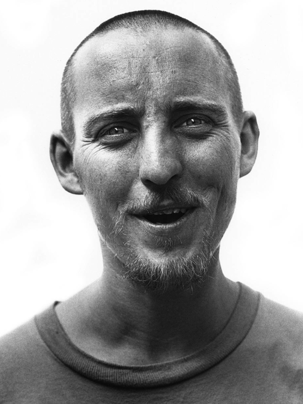
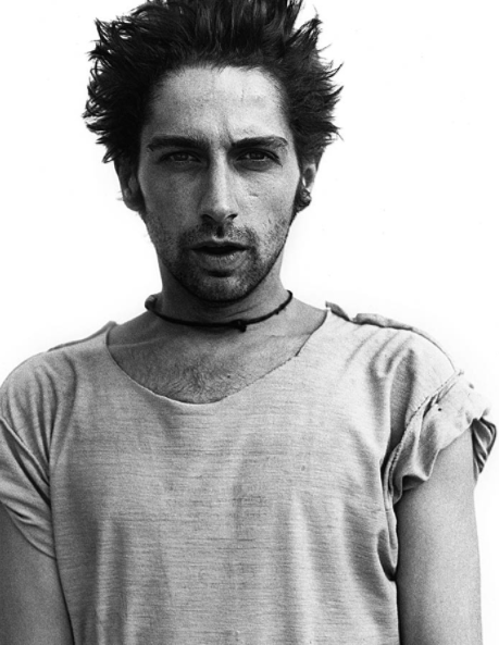
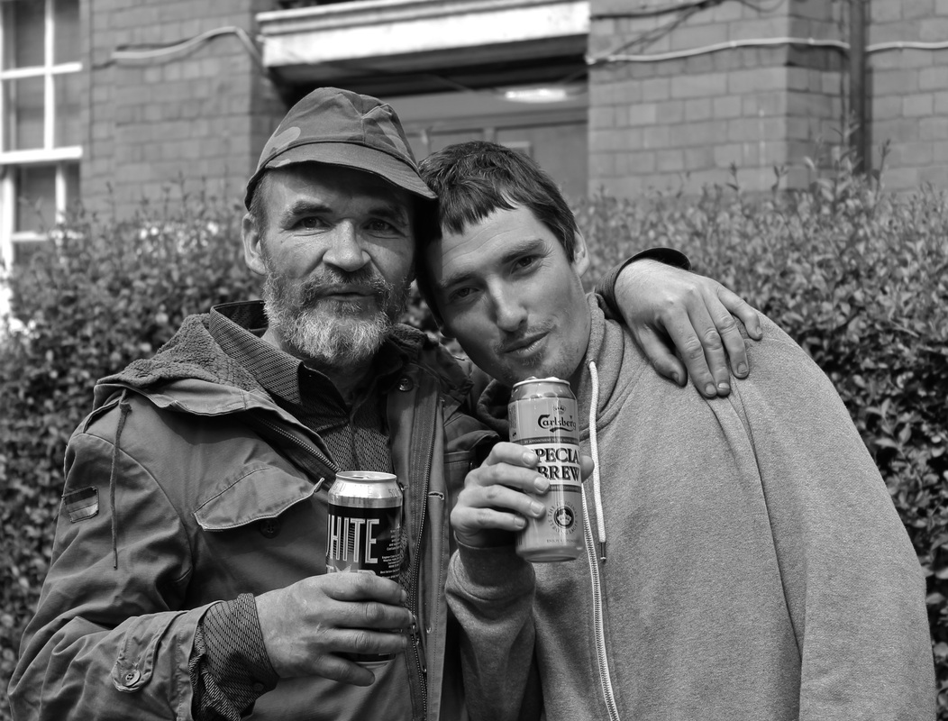
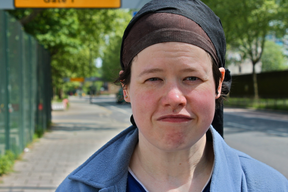
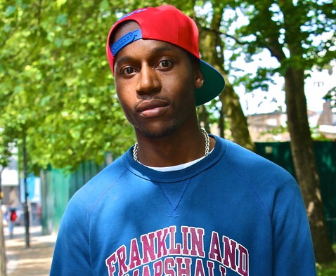
I then developed this into taking portraits to elaborate the idea of areas struck by poverty, photographing was really interesting as I met an array of different people. I met two men who were affected by alcohol and were homeless. I also met a man who had been affected by alcohol and drugs and was living in a homeless shelter after spending years on the street. Another person I met was also homeless due to personal circumstances but had a really bright and cheerful personality. However there were also completely normal people going about their day to day lives who I also found interesting to photograph. I really enjoyed photographing in this area as there was such a range of different people in one area.
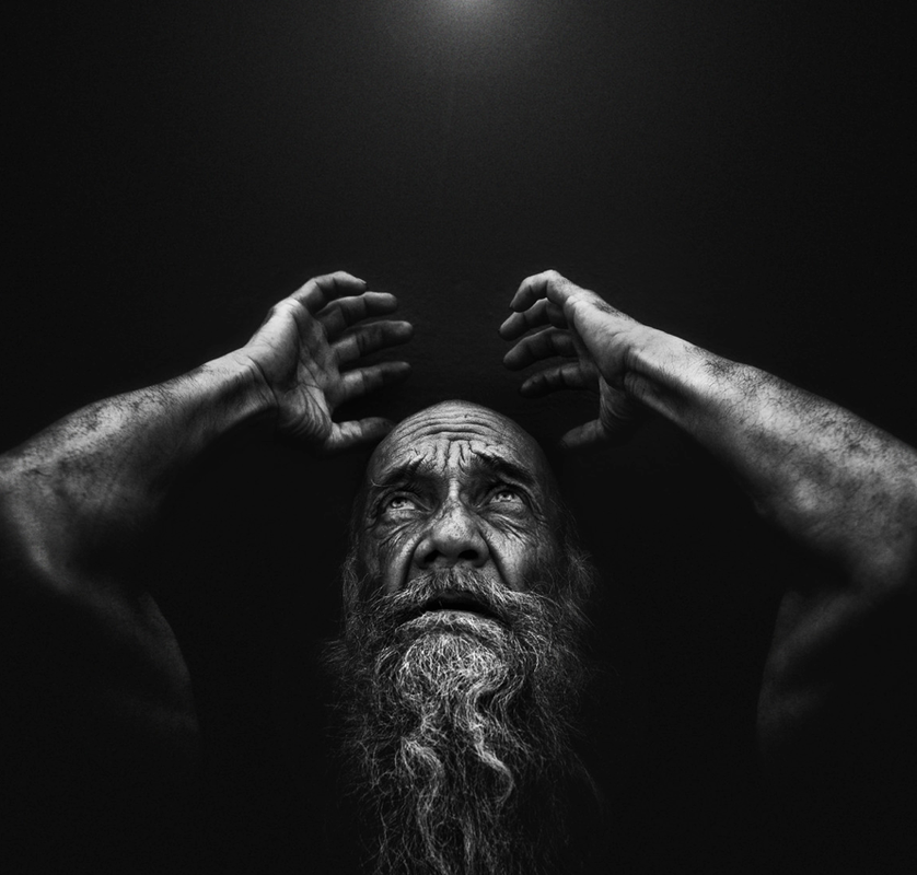
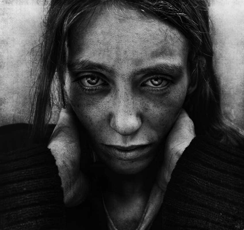
A photographer who inspired me with this development is Lee Jeffries who is an American photographer who took portraits of the homeless, the images are extremely powerful and are also shot in black and white adding to this. I really like how they show the pain and sadness in the persons eyes and how it represents how desperate they are. The quality of the images again bring clarity to the suffering the person is experiencing. His images inspired me to photograph the reality of people living in poverty and to try and capture their stories through their faces.
I then developed this into taking portraits to elaborate the idea of areas struck by poverty, photographing was really interesting as I met an array of different people. I met two men who were affected by alcohol and were homeless. I also met a man who had been affected by alcohol and drugs and was living in a homeless shelter after spending years on the street. Another person I met was also homeless due to personal circumstances but had a really bright and cheerful personality. However there were also completely normal people going about their day to day lives who I also found interesting to photograph. I really enjoyed photographing in this area as there was such a range of different people in one area.
A photographer who inspired me with this development is Lee Jeffries who is an American photographer who took portraits of the homeless, the images are extremely powerful and are also shot in black and white adding to this. I really like how they show the pain and sadness in the persons eyes and how it represents how desperate they are. The quality of the images again bring clarity to the suffering the person is experiencing. His images inspired me to photograph the reality of people living in poverty and to try and capture their stories through their faces.
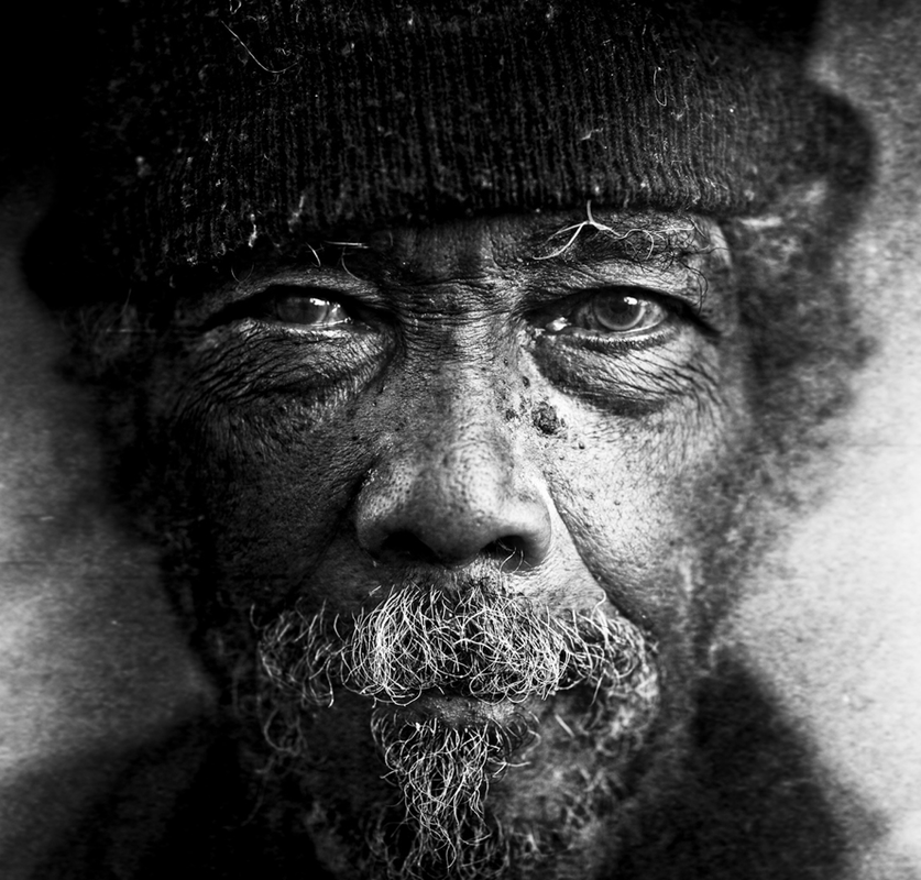
Another photographer is Michael Heffernan who photographed homeless people in London, I really like his images and the powerfulness portrayed through the clarity of the images. I feel again the effect of it being in black and white adds to the meaning of the picture and highlights the desperation of the person.
|
|
Third Development
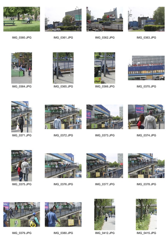
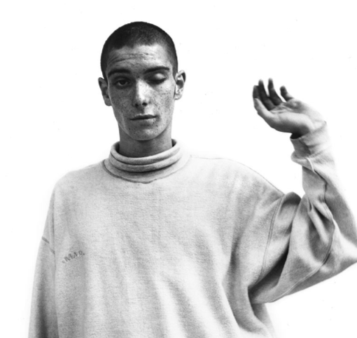
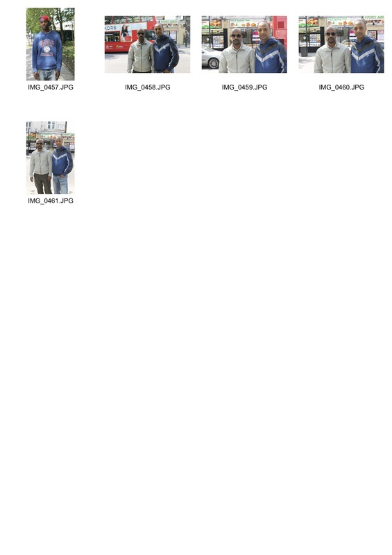
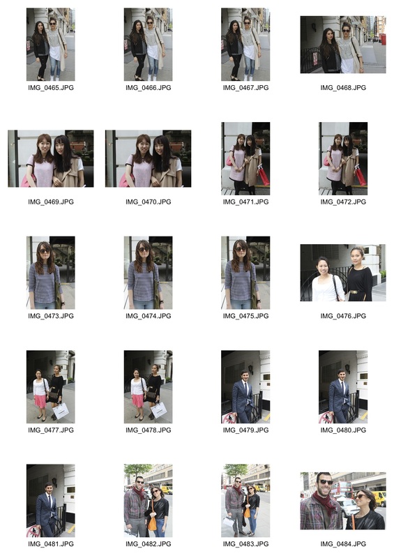
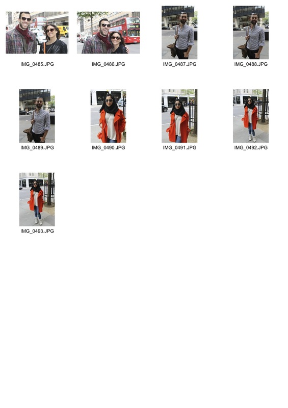
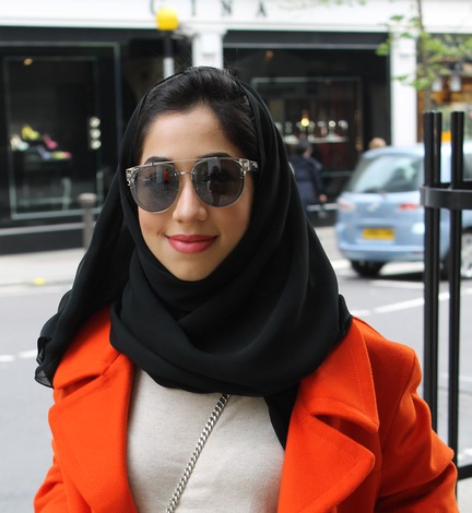
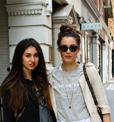
For my third development I wanted to do a contrast to poverty and explore wealth, I went to Chelsea and Knightsbridge to photograph the wealth which is evident there. I noticed while there that the clothes are the most prominent things which stand out and wanted to focus on that. There was very prominent wealth in this area and I mainly photographed on a street which had Harrods round the corner and many designer shops on it. It was a complete contrast to the area I had shot in for my first and second development and it amazed me that there is such diversity in London.
A blog which helped influence this development is called 'The Sartorialist' which is a street photographer in New York called Scott Schuman whom focuses on high end street fashion.
A blog which helped influence this development is called 'The Sartorialist' which is a street photographer in New York called Scott Schuman whom focuses on high end street fashion.
|
|
Final Pictures
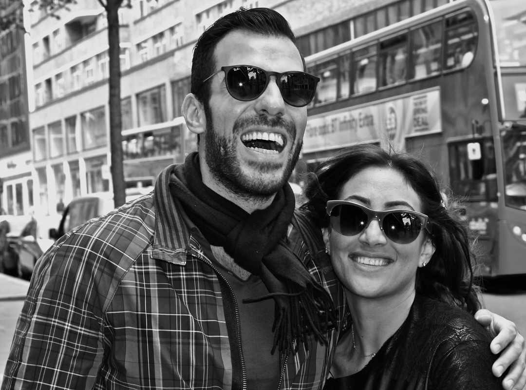
For my final pictures I wanted to use a few of the pictures taken from both places, I wanted the black and white pictures of the drunk men and the smiling couple to be used as a strong contrast to one another to reflect the happiness in the couple and the hardship and pain in the men. Then I wanted to use four other images which I liked and have them to act as a contrast of the different places.
Conclusion
In conclusion I felt the project went well and was happy with my final outcome. Despite it being hard at times to get people to stop and have their photograph taken most people were willing. I like the clear sense of diversity shown in the images especially represented through what they're wearing and how they are presented. However if I had had more time I would of liked to of done another shoot with holding up a white background so that there would of been more of a focus on the face, and also had the framing to be of just the neck upwards, this would of given a more professional look to it. Lastly I would of liked to perhaps of spoken to the people more and found out more about their lives, examples of people who have done this is a Facebook page called 'The Humans of New York' who photographed random people on the streets of New York and asked about their story to caption the picture.
